ELISAVA - Typography & Graphic Design
 Download Image
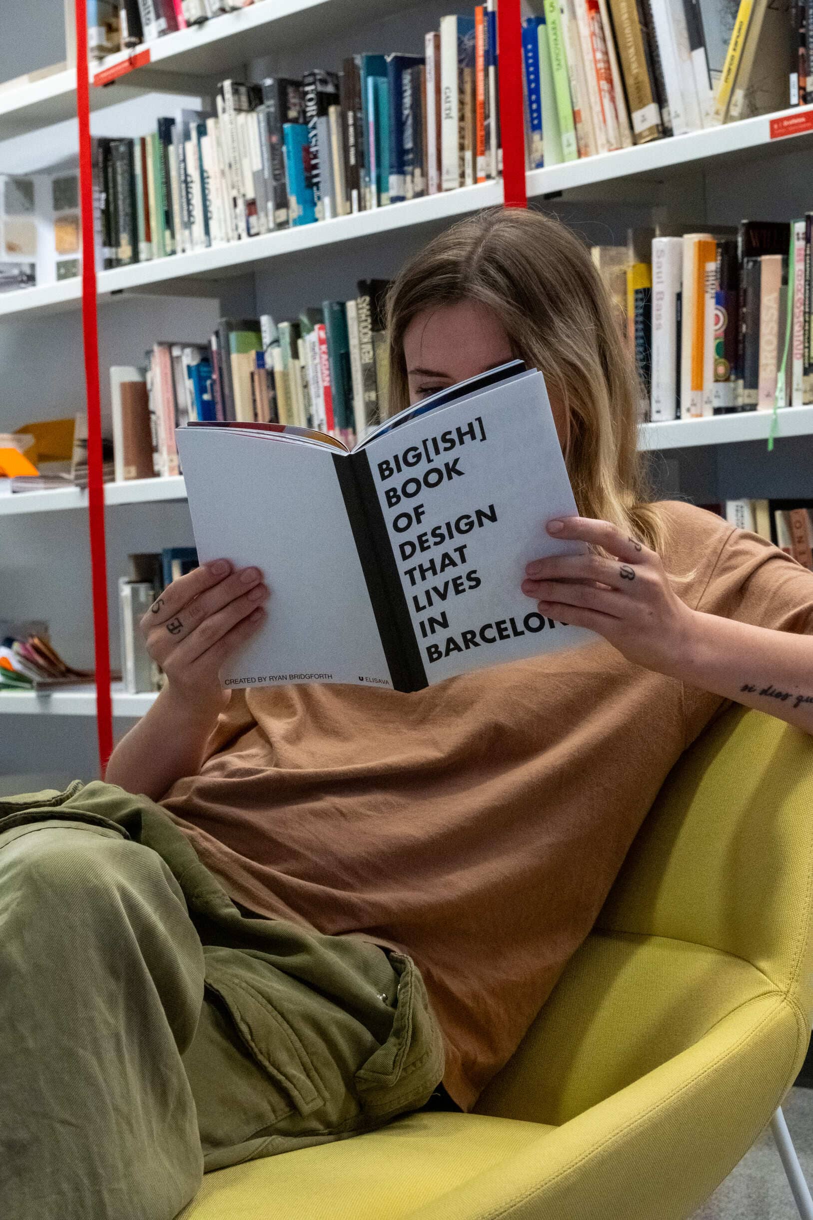
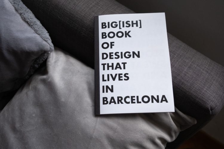
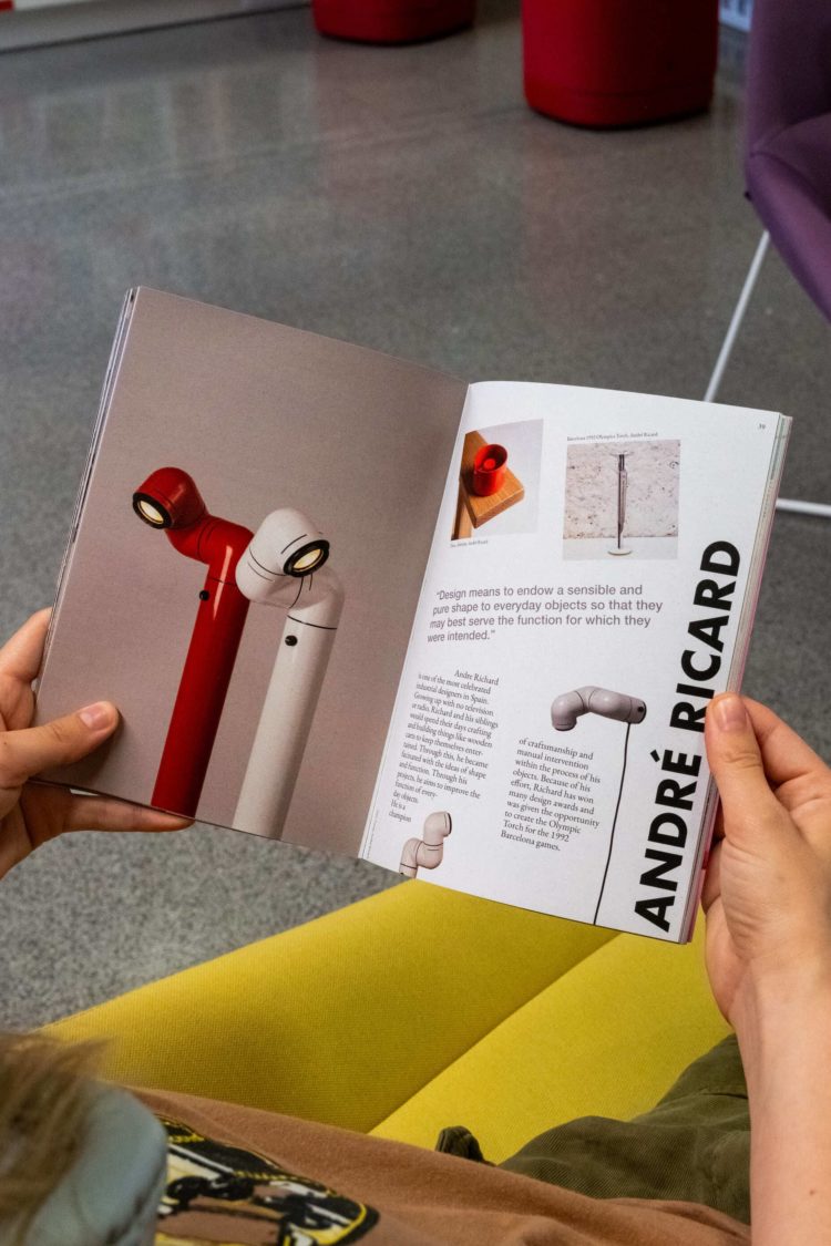
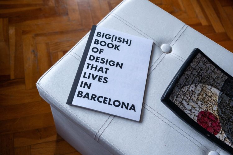
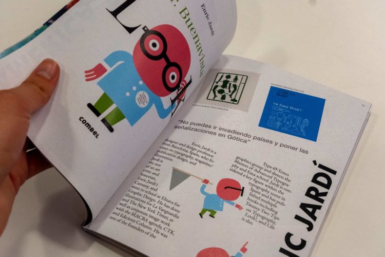
My time at Elisava Barcelona School of Design and Engineering was a time I will never forget. I learned so many new things, made so many new friends, and created pieces of work I am extremely proud. For my second graphic design course ever, Typography & Graphic Design was intense, but forged through the fires, I came out as a significantly improved designer. I don’t usually start my posts at the end, but the Designers Book project was the capstone creation of this course. This project evolved significantly from its first iteration (four google doc pages) to the final result. I’ve become extremely interested in delving deeper into editorial design because of it.
 Download Image
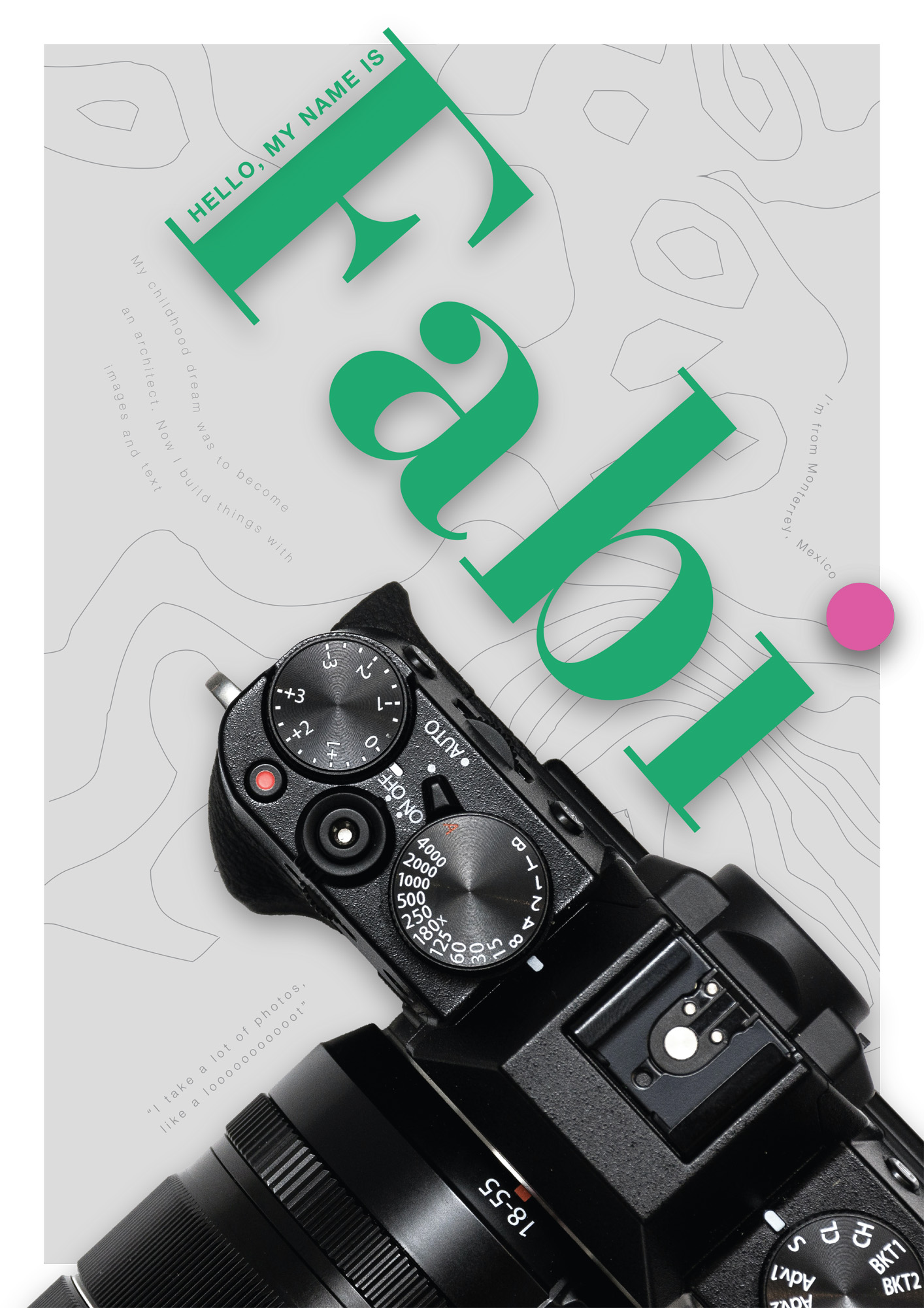
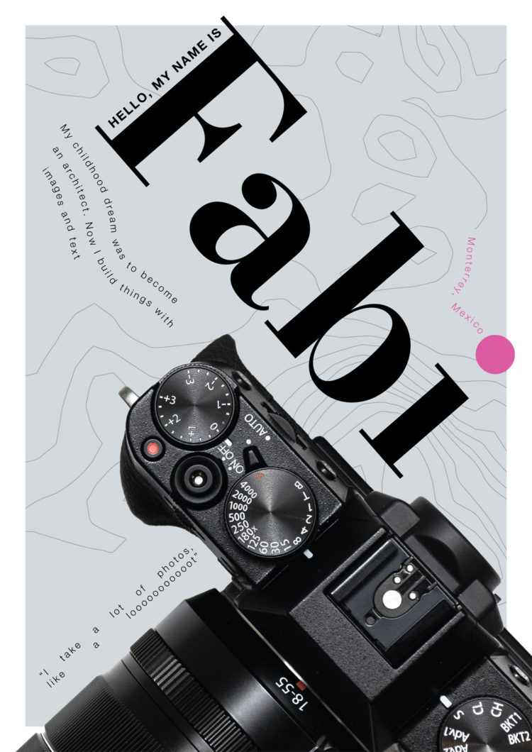
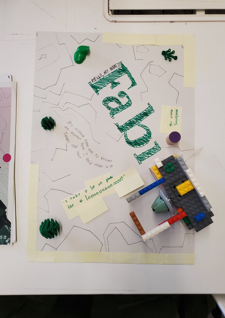
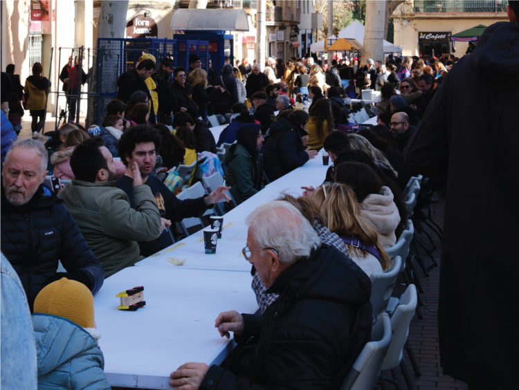
Our next project tasked us with interviewing a classmate and trying to communicate who that person is in a poster and motion video. After our first delivery, we were given a workshop that took us out of the screen and were assigned with recreating our poster using only physical objects and tools. After that, we took the feedback from both and created a final design, showcased here.
 Download Image
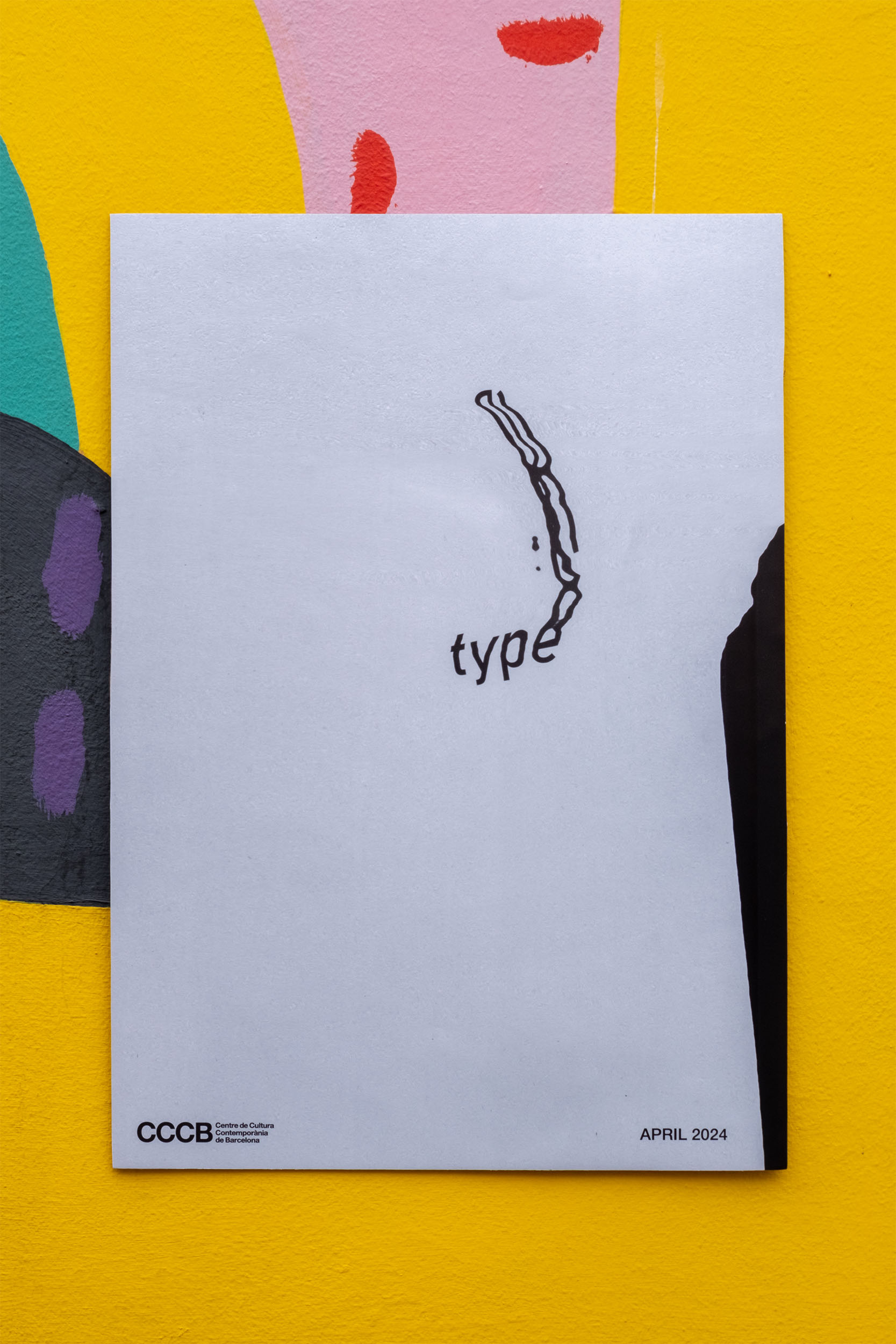
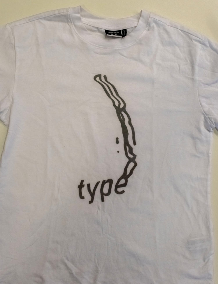
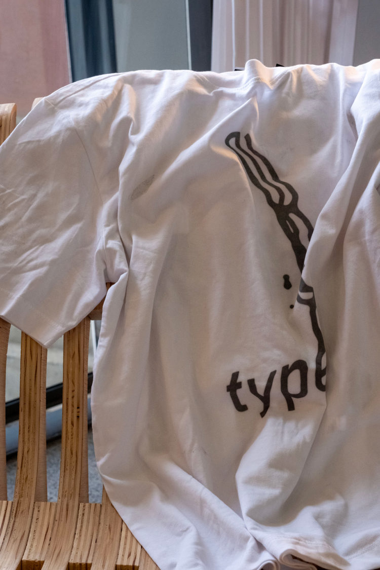
The third project began with an experimental process where we were told to print out the word “type” on a piece of paper (with no additional context) and to use scanners to manipulate the text at least 25 times. It was then revealed that the visuals were going to be transformed into posters and a t-shirt for a hypothetical typography conference we were going to create. As a class, we used a mind mapping technique to come up with the theme of the conference and selected the scans we felt fit into three categories we came up with. The methodology was completely different than anything I have experienced, but it was truly eye-opening to the possibilities of design.
 Download Image
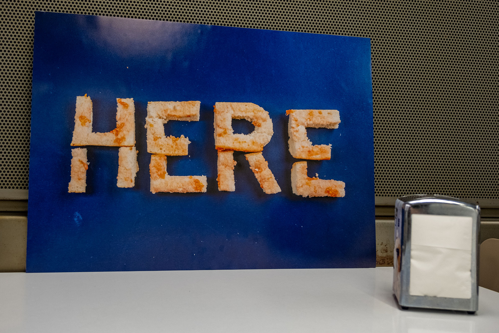
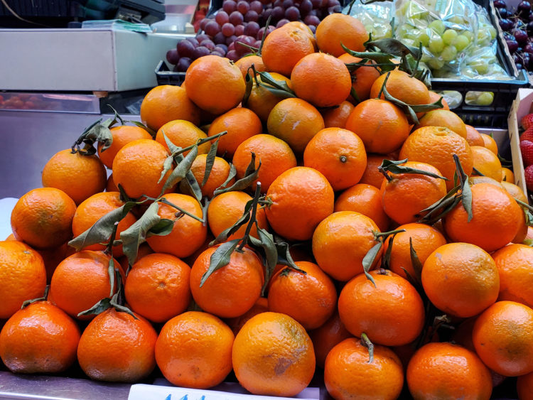
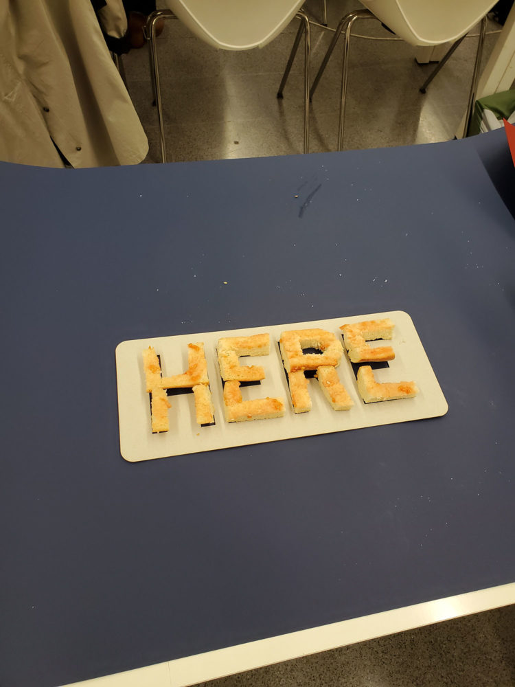
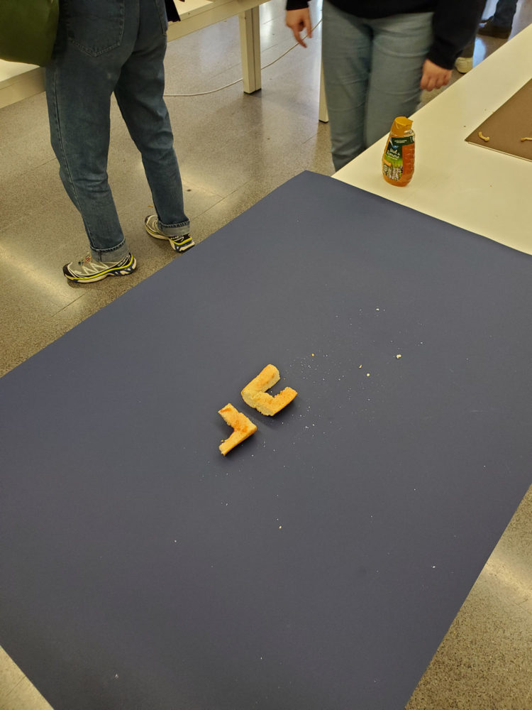
Our next project involved creating typography with food, revolving around a specific concept related to the future of food. My concept was around the idea of food sovereignty and was inspired by a market close to my house in Clot as they organized lunches for the community using locally sourced food and the Mercat Central in Valencia, which I visited during the project. The word I used was “HERE” and it was created using bread and tomatoes to create “pa amb tomàquet,” a Catalan speciality. The piece was eaten by my classmates during the workshop.
 Download Image
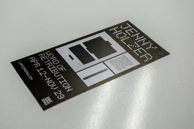
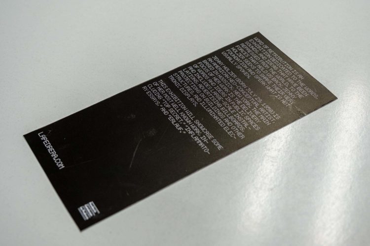
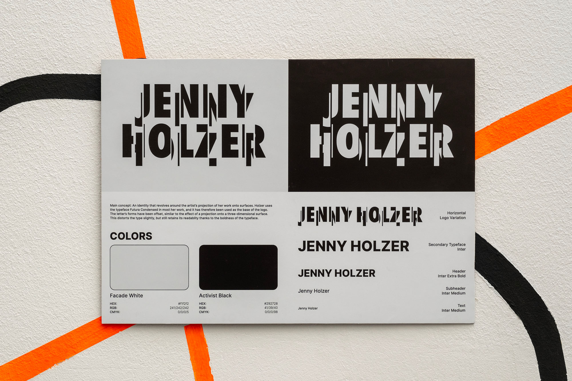
Our fifth project had a very simple brief: create a brand identity for an artist we had selected for a smaller, filler project beforehand from a group of around five artists. The artist I chose was Jenny Holzer, who I found very fascinating. Her work involves projecting her message onto surfaces, either via projectors, prints, LED signs, and more. My goal with the identity involved creating a staggered visual look to the type face, mirroring the effect of projection onto three-dimensional surfaces. The logo also utilizes Futura Extra Bold Condensed, which appears in many of her most famous works.
 Download Image
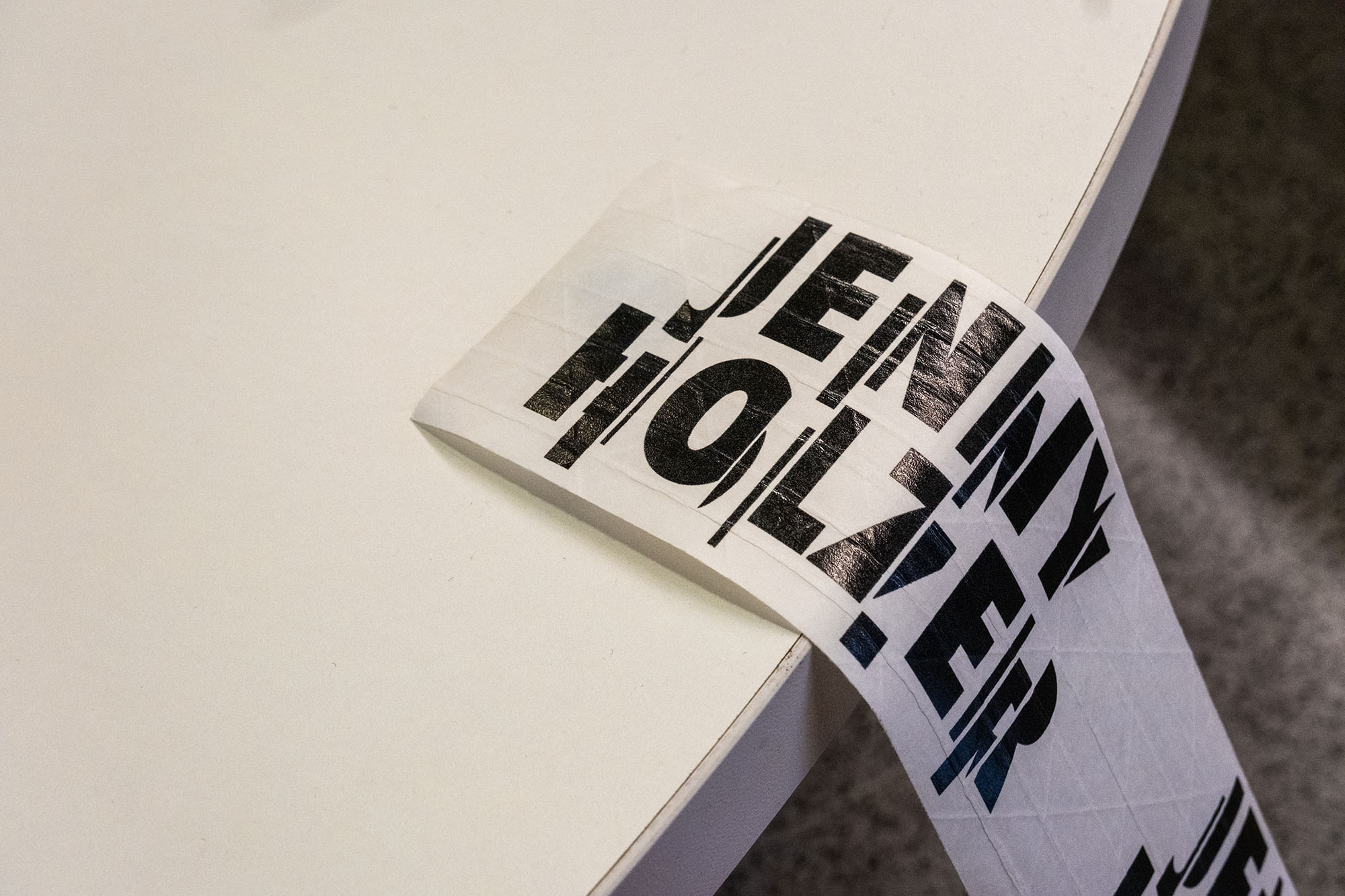
We were also asked to create an additional communication piece along with the identity, so I created printed tape with the logo. I saw it as a fitting way to tie the message of the brand (projection of a message onto a surface) to a physical product (tape, and therefore sticking the logo onto a surface).
 Download Image
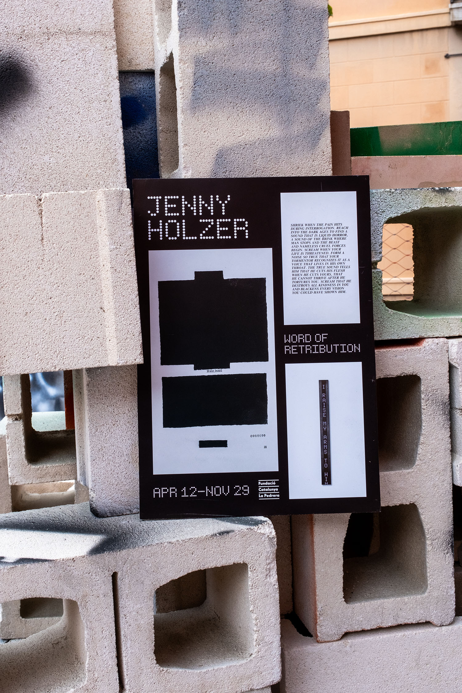
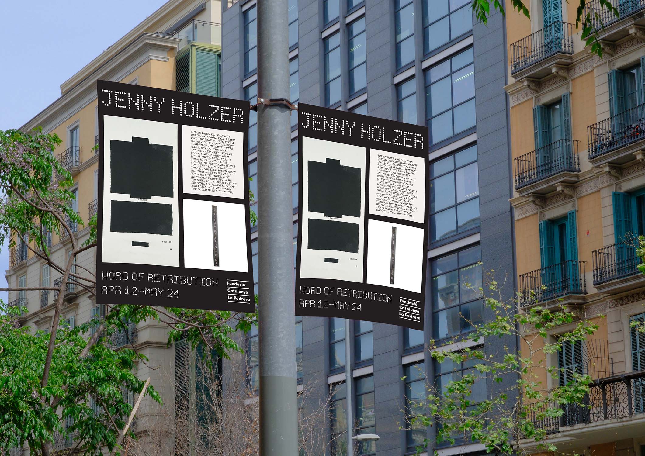
The last project asked us to take the same artist from the branding identity and create a mock exhibition for them. However, we were told not to use the logo we just created in the promotional materials as we were essentially creating a new “brand” for the exhibition itself.
 Download Image
It was pretty interesting trying to adapt the same general design to different formats and made me think more about creating modular systems in design.