ART 353 – Web Design

Download Image

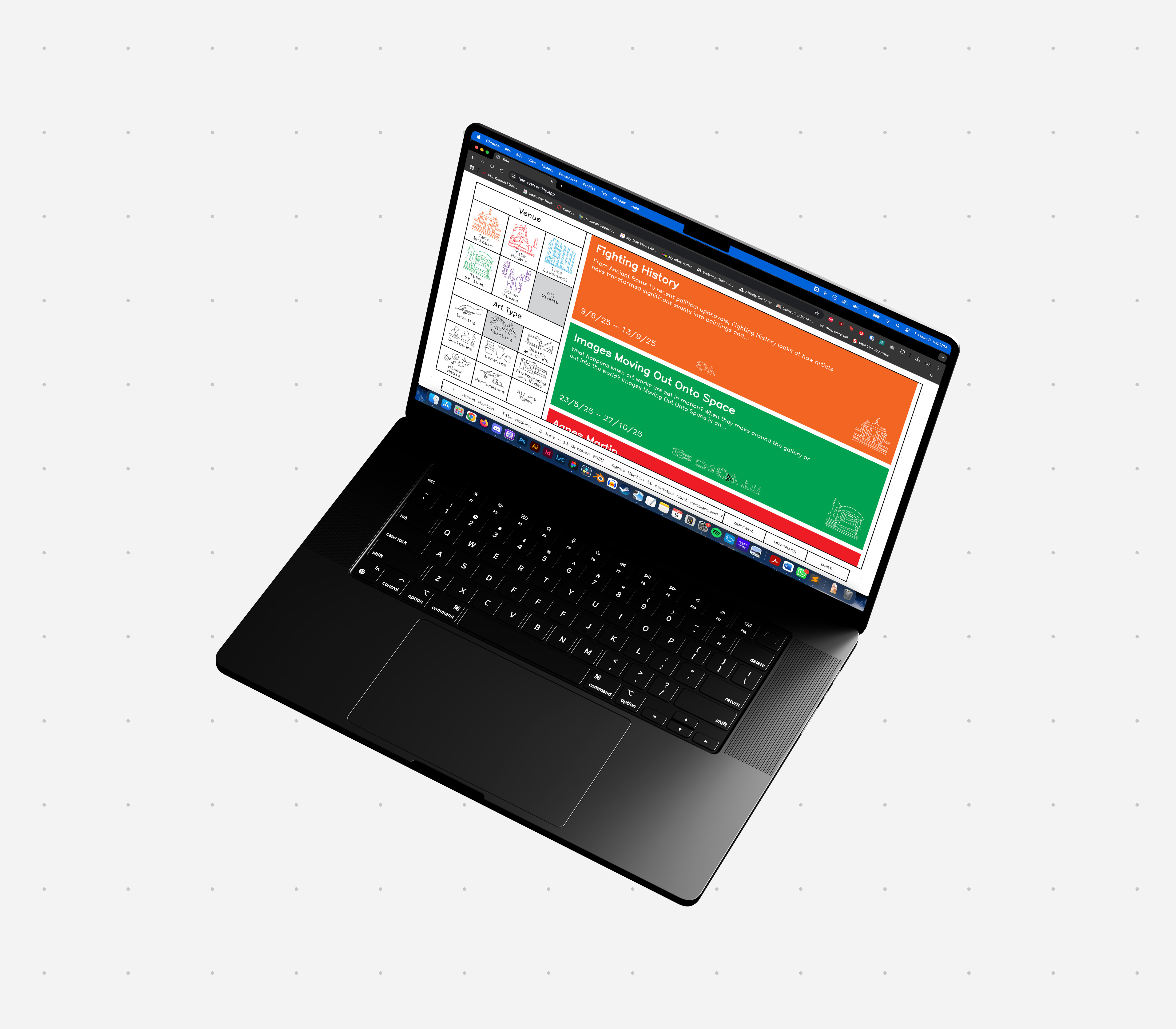
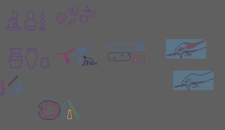
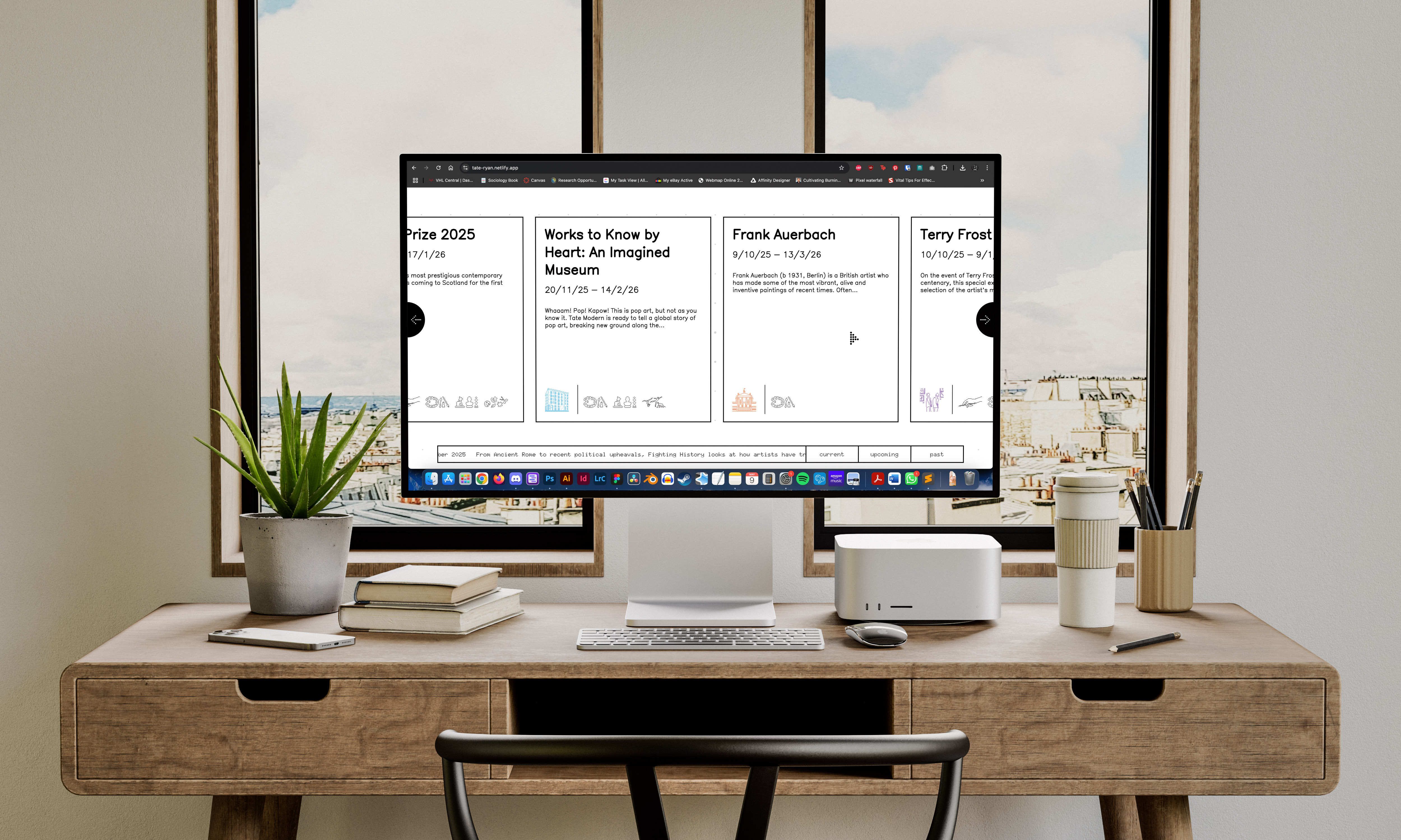
During my Junior year, I wanted to explore the possibilities of designing for the web. My dad is a web developer and has been my entire life, so this specific skillset has been on my mind for a while. We only had two major projects for the entire semester since the technical skills necessary to build a website take time to learn. Our first project asked us to design a desktop landing page website for one of four art institutes offered and its exhibitions. The Tate was an obvious choice to me. It gave me multiple interesting challenges like having four distinct locations, but the thing that drew me in immediately was their logo. Halftones/dots have been calling to me all semester and I really wanted to try and use the basis of their logo to create a whole visual language and expand the “branding” of the website to include it, which I felt was sorely lacking in the actual website they have. Immediately I went into trying to find website inspiration that had that sort of visual look and organization I was looking for. I wanted my website to inhabit a sort of liminal space between the early web look and a truly modern, but limited look inspired by the visuals of companies like Nothing and Teenage Engineering. 

Download Image

One limitation that truly set off my imagination was that we could only use 3-5ish images for the entire site. I decided from the beginning that I was going to make a site with absolutely zero images to try and push the limits of my ability to communicate effectively. This challenged me to come up with a visual communication method of icons and color to indicate location and style of art in the exhibition, which was something I am extremely proud of. Additionally, I wanted each section of past, present, and upcoming to have a unique way of showcasing the exhibitions, further pushing me to think in new ways of communicating, on the surface, extremely similar information. The goal then was to, in each section, set up my cues for what the icons meant and what the colors meant, and gradually take away more and more information until you’re left with a close to bare-bones application in the final section. This took a lot of trust in my system to set the information correctly, but I believe I was truly successful.

Type study for the upcoming exhibition section
Messing around with creating icons
Download Image

Nothing was more exciting then seeing the website come to life as I coded it, and I really found a new love in writing HTML and CSS. Having the instant gratification of reloading the page to see the work come to life never got old. On a personal note, it gave me an opportunity to collaborate with my Dad. Being able to share progress updates and get help building a JavaScript plugin for an ambitious filter system was the highlight throughout the entire process. This project really became something far beyond a school requirement for me, and frankly, I was taking a lot of extra time on it to make it just right, simply because I loved it so much.

Download Image

I think easily the most successful part about my website is how accurate I was able to get it to the comp without having to rework too much. Having an understanding of how the box model worked before getting into such a big project really helped me design with it in mind, which made the process extremely smooth transitioning into CSS land. I am really happy with how active I was able to make it, it feels very alive and engaging with lots of micro-interactions that were implemented the more I played around with it. Overall, I feel really satisfied with every part of the process and the final product is something I will be parading around for years to come. My website can be found live here.

Download Image

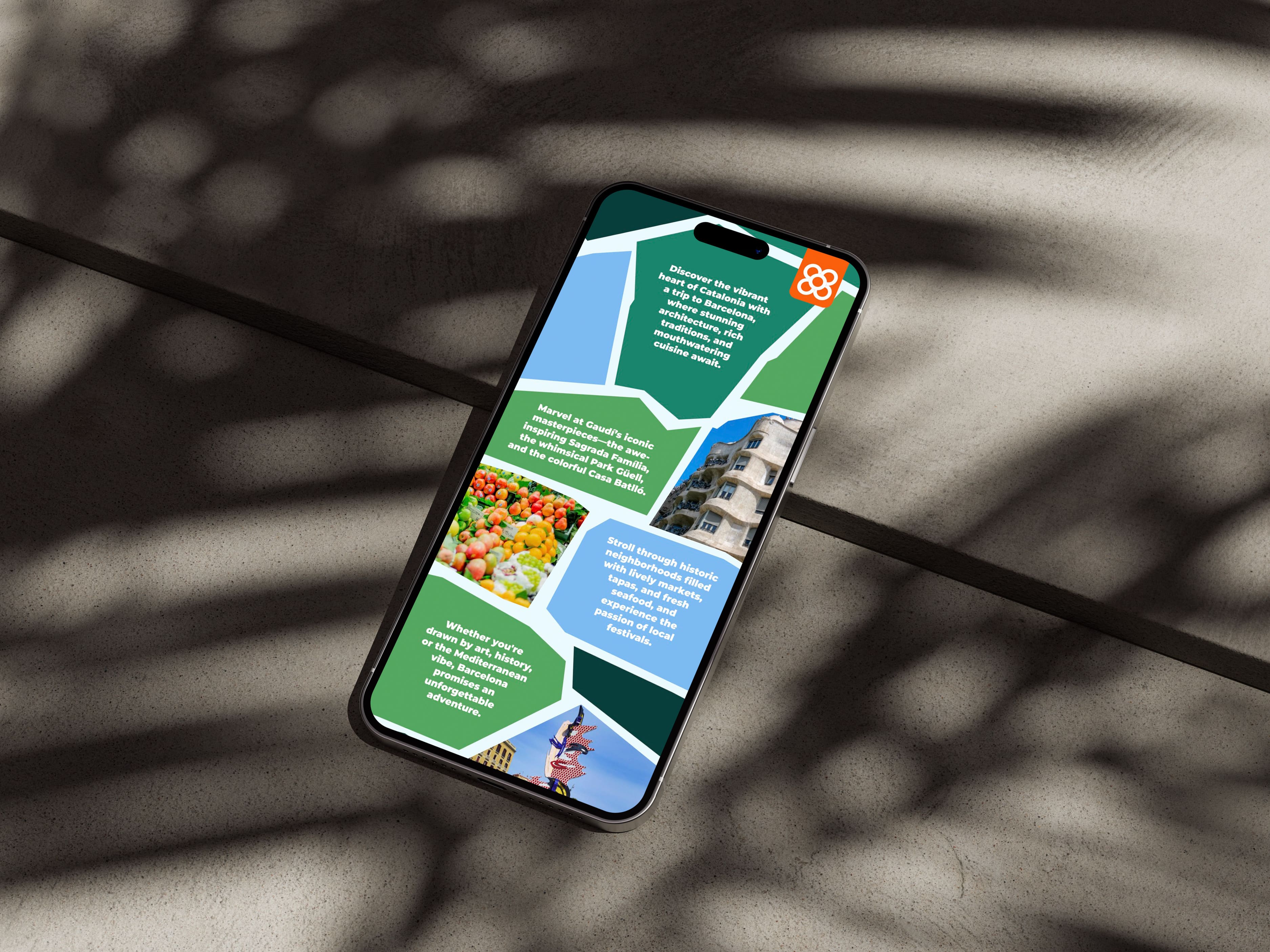
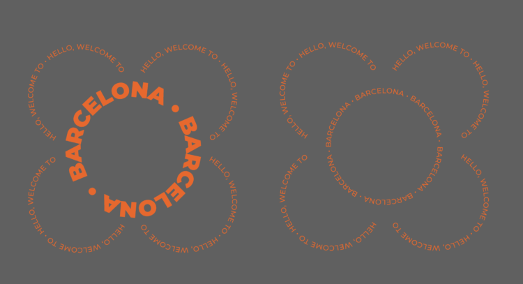
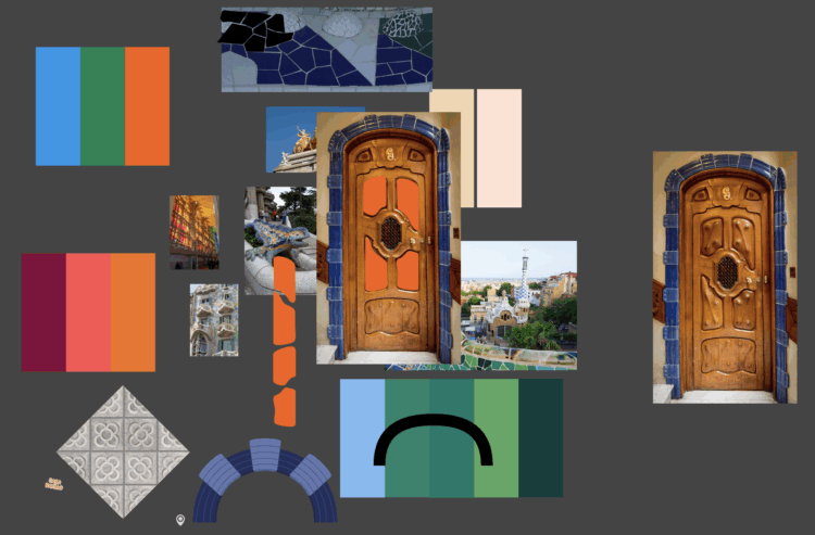
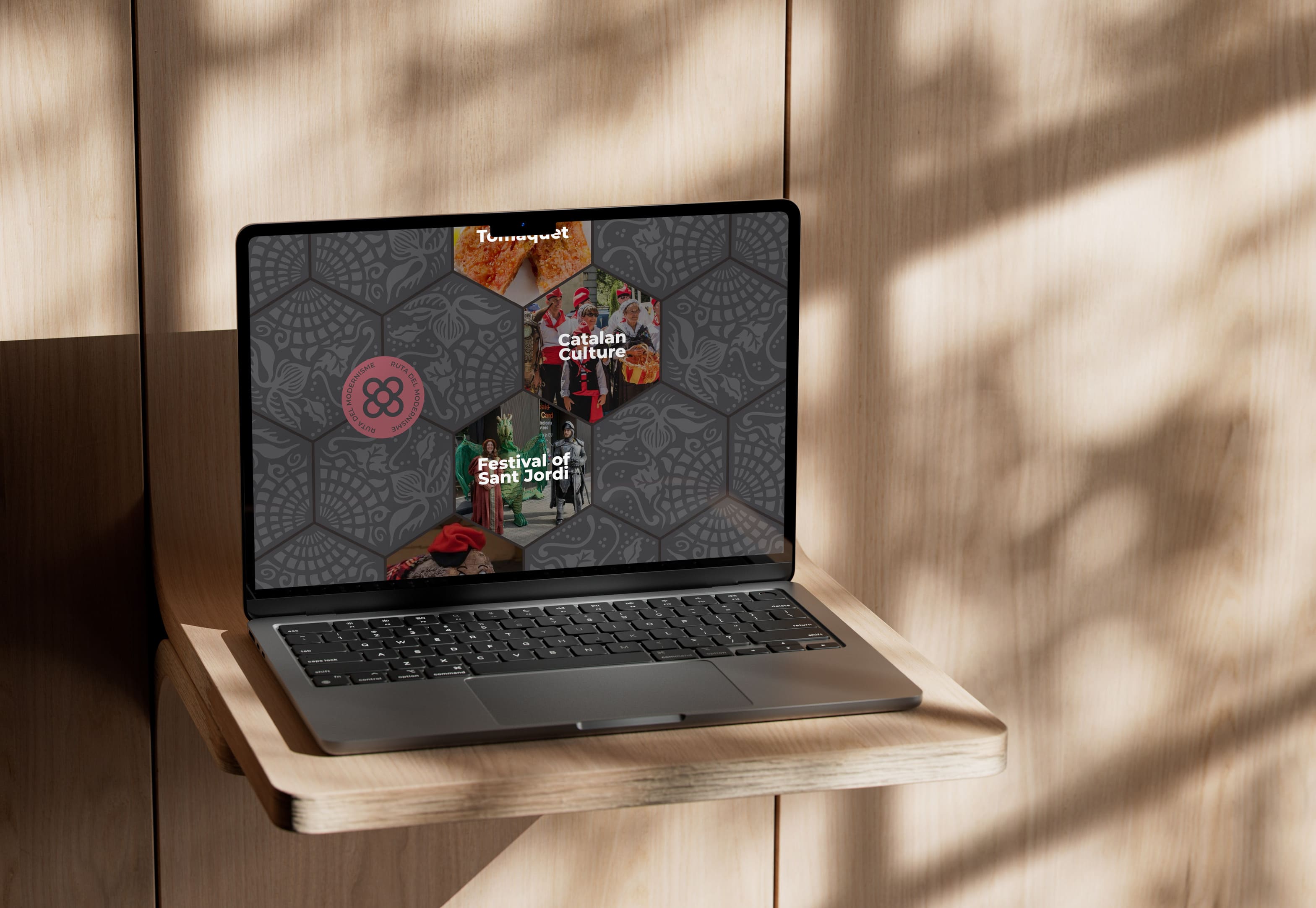
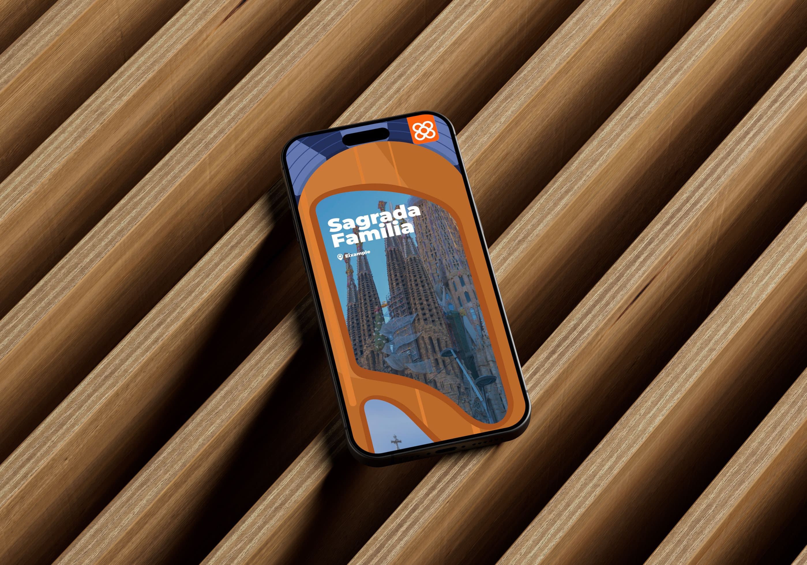
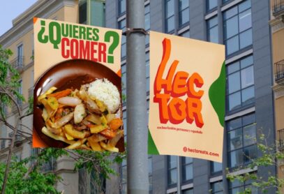
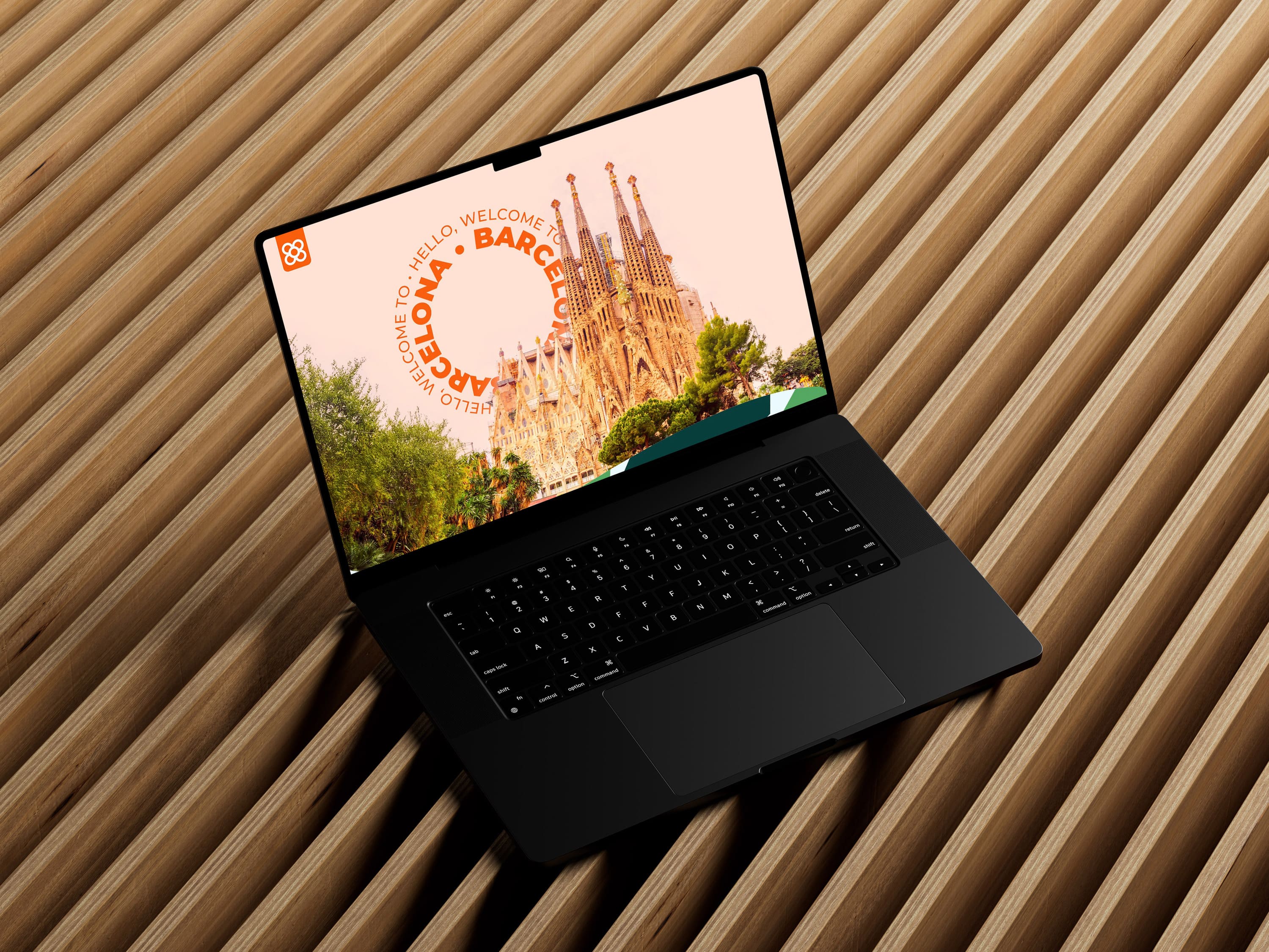
Our second project was a completely Figma based project that focused on designing for responsive screens. Our content prompt was a website for a destination. After finishing up the Tate website, I felt like it’d be interesting to go in a completely opposite visual direction and try and bring in much more color and boldness to my design. The destination that came to mind immediately was Barcelona (I cannot get that place out of my head for very long without creating some homage to it). I thought it’d be interesting to bring Modernisme, a Catalan art movement from the late 19th, early 20th century into a digital/vector based world of web. I was finding myself inspired by the bold, thickly weighted lockups in some of my visual research and that informed most of the direction I went. I also wanted to try more moving type similar to the ticker in the previous project, this time in a circle.

Download Image

The biggest, and likely most obvious challenge I had was creating something that not only worked between mobile and desktop, but also was still striking and bold in both versions. I had both my mobile and desktop comps in mind from the beginning, but I chose to start with mobile because I felt it’d be easier to build outward from (I also just really wanted to try my hand at a new aspect ratio from the get go). Additionally, I had barely used Figma’s design tools before, so I had to learn how to use it on the go. Guided by my illustrator knowledge and a lot of youtube how-to videos, I adjusted quite well to the new design environment.

Using the idea of type to create a tile pattern was a fun idea I had from the start. I didn’t end up using any version like the tile in the final design, sticking to just a circle
I wanted to pull colors directly from Barcelona with little intervention in between. The city felt cohesive while I lived in it, so I suspected taking colors from some of the images I took would provide cohesive within the design as well.
Download Image

One of the most exciting things I got to do was learn the Figma prototyping tools. It scratched an animation itch I had been missing for a while and learning the capabilities and limitations was a lot of fun. What I found interesting was I designed mobile first, but then designed interaction desktop first. Not having hover to trigger many of the animations I had made for desktop was tricky in mobile, but I spent a lot of time contemplating how to make it still feel alive and interactive by using idle animations, without being too overstimulating for the user.

Download Image

I think I was quite successful in creating very comparable experiences between mobile and desktop. This project made me want to explore Figma a whole lot more, especially after a few comments from my classmates that this didn’t look like my first project in Figma ever. I think I could get the hang of it more if I tried. Visually, I am really happy how my recreations of the city look in the final design. Here is a prototype of the mobile version and the desktop version.