ART 451 – System Design (Graphic Design IV)

Download Image

My System Design course focused on designing for brands and branding systems. For the first project, we were told to find a brand and a product, write five adverbs that described the brand’s current image, and then  make a 3 slide instagram ad based on those adverbs. I chose the HIFIMAN Sundaras as I thought it’d be a unique challenge to advertise for a relatively niche hobby of hifi audio (I own these headphones myself and love them). I picked the adverbs “technical,” “niche,” “performance for value,” “professional,” and “cutting-edge.” My goal was to create something in line with the clean, simple product advertising I had seen from other more well known headphone brands like Sennheiser and Beyerdynamic.

Progress of the initial comp
Starting to push the comp in fun ways
Download Image

The second part of the project involved flipping the adverbs to their antonyms. The adverbs changed to “simple/straightforward,” “common,” “scammy/misleading,” “amateur/unprofessional,” and “outdated/outmoded.” This provided a unique challenge and forced me to get creative building around a now completely counter-hifi identity. Overall, this project was a great opportunity to flex the skills I had learned at an advertising agency I worked with over the summer, being forced to quickly switch between account styles.

Start of the antonym version
Almost complete version before some tweaks
Download Image

The next project asked us to create a logo package using an alphabet soup brand on Amazon with minimal to zero branding. During the research phase, I focused on simple goods that related to things I liked, and ended up with a shoelace company in relation to my enjoyment of sneakers.

Download Image

I had never really realized there were dedicated brands that made “premium” shoelaces, especially catered towards sneakerheads until I dived pretty deep into my research, but the brands I found were extremely helpful to see how they approached branding laces. I noticed that almost all of them somehow integrated the laces within their typographic logos, so I decided I would put my own spin on it. I also wanted to lean into the collegiate style in terms of typographic look and especially colors.

Download Image

Working with a loose flowing form for the type was super fun. It was, however, a headache to try and work the pattern of the lace lines around since the form went in front and behind itself. Trying to figure out the best way to map a pattern in illustrator was tough, but I came up with a good solution using some of the built in brush tools. 
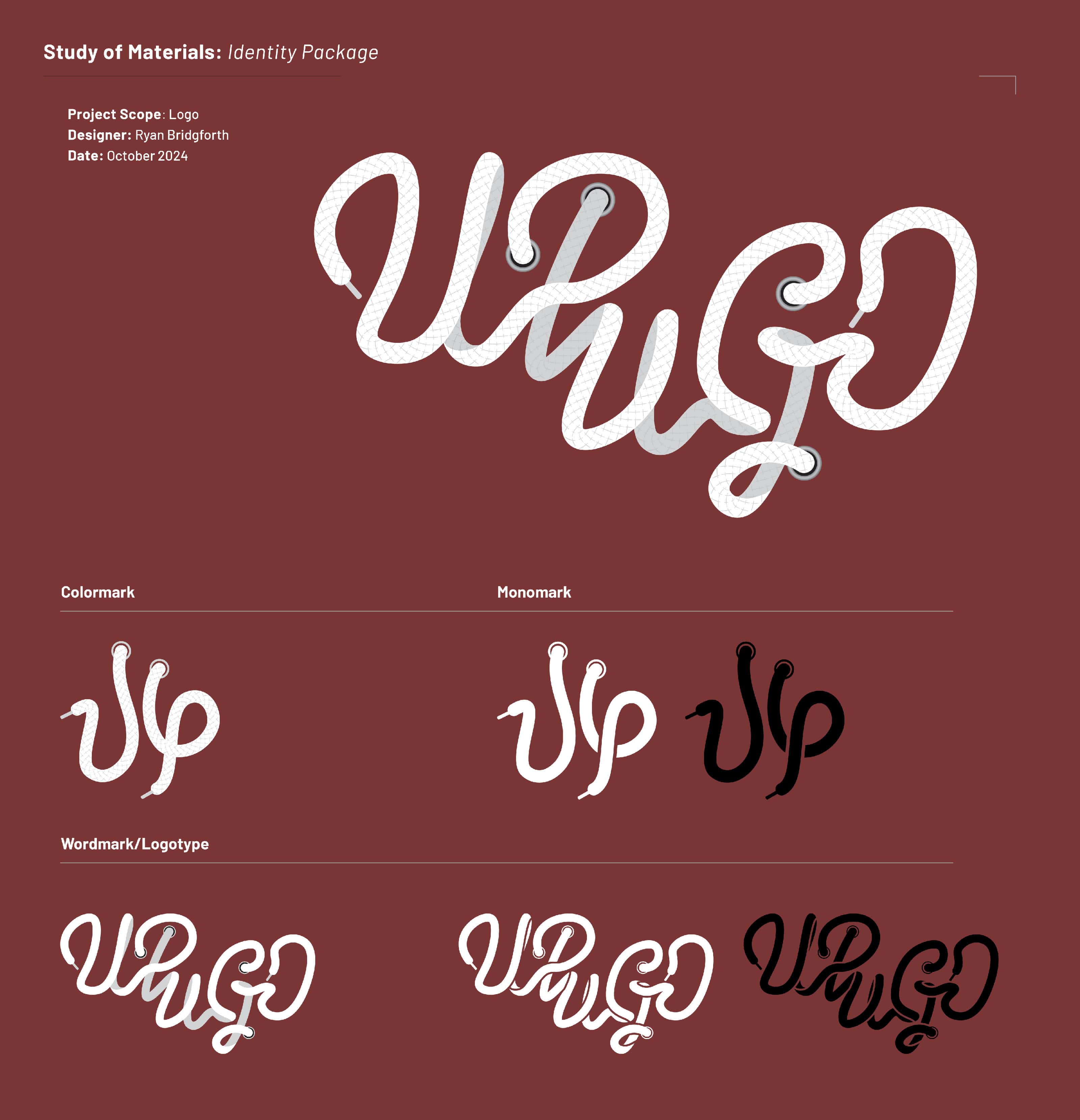
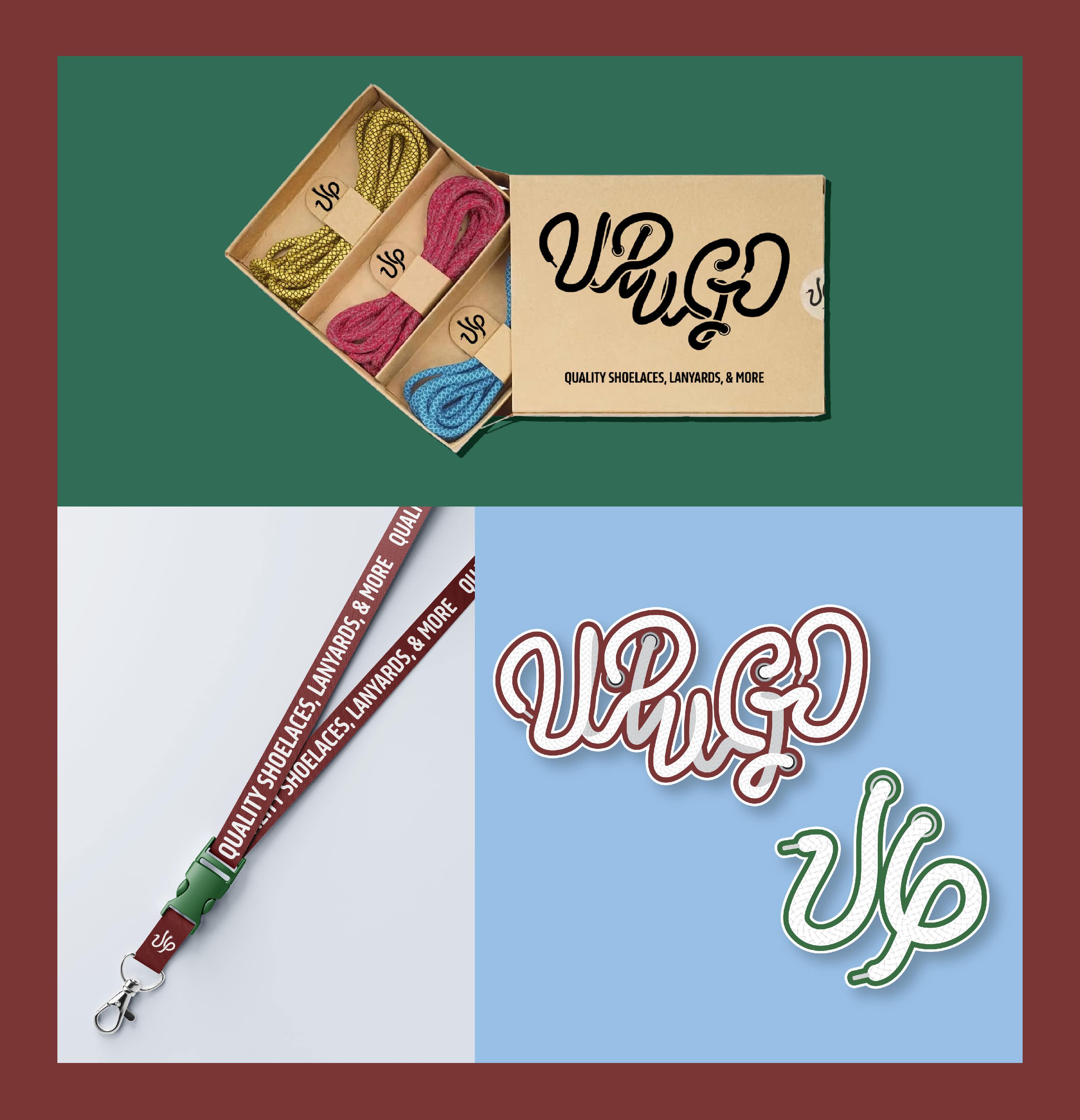
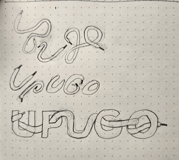
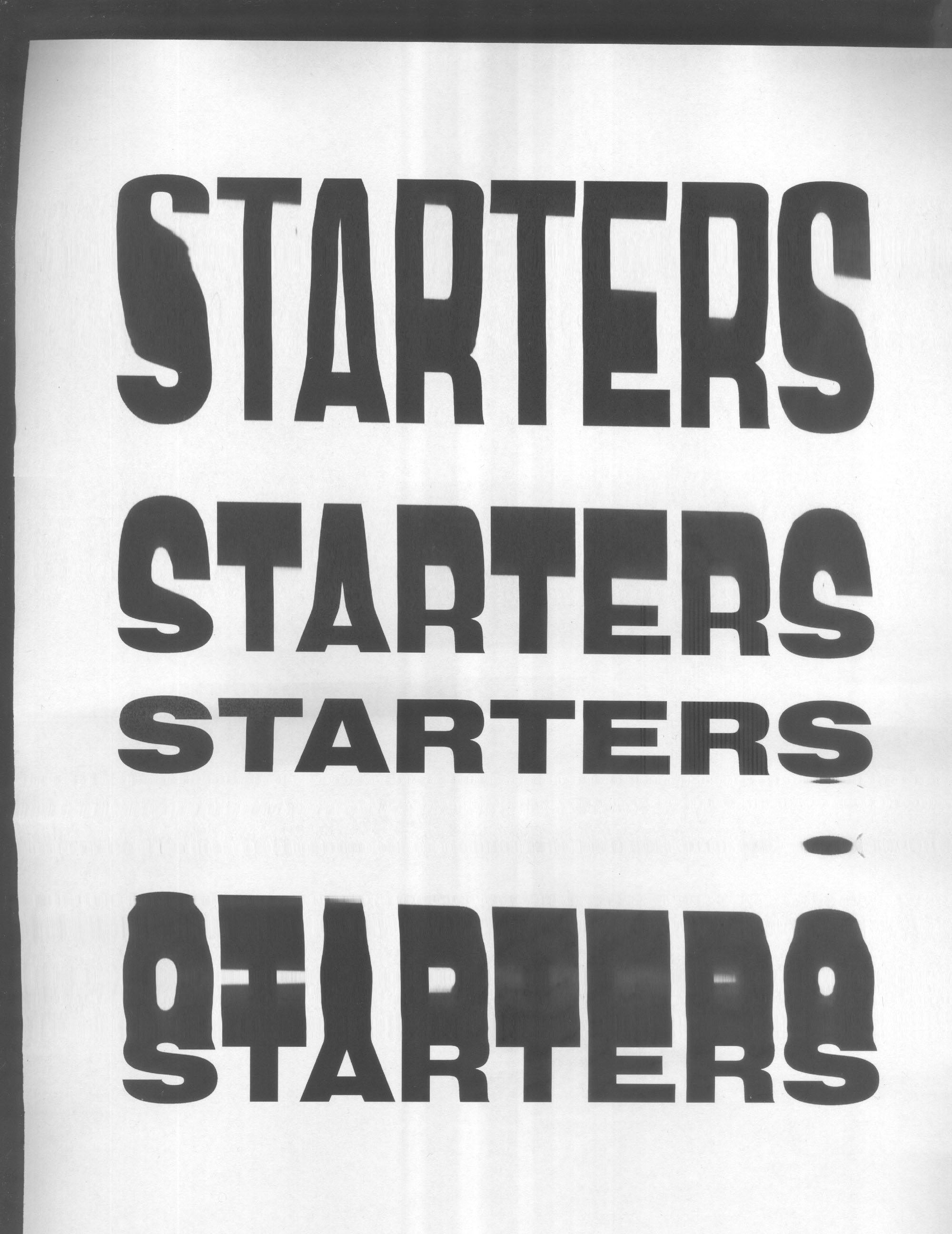
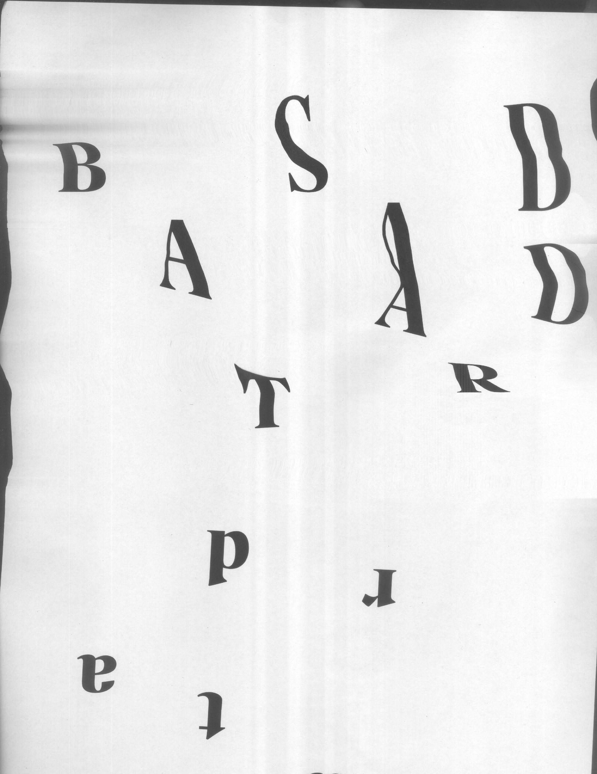
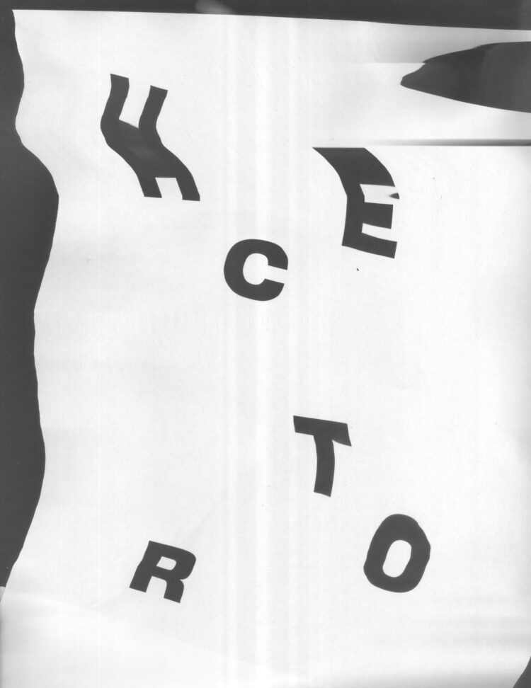
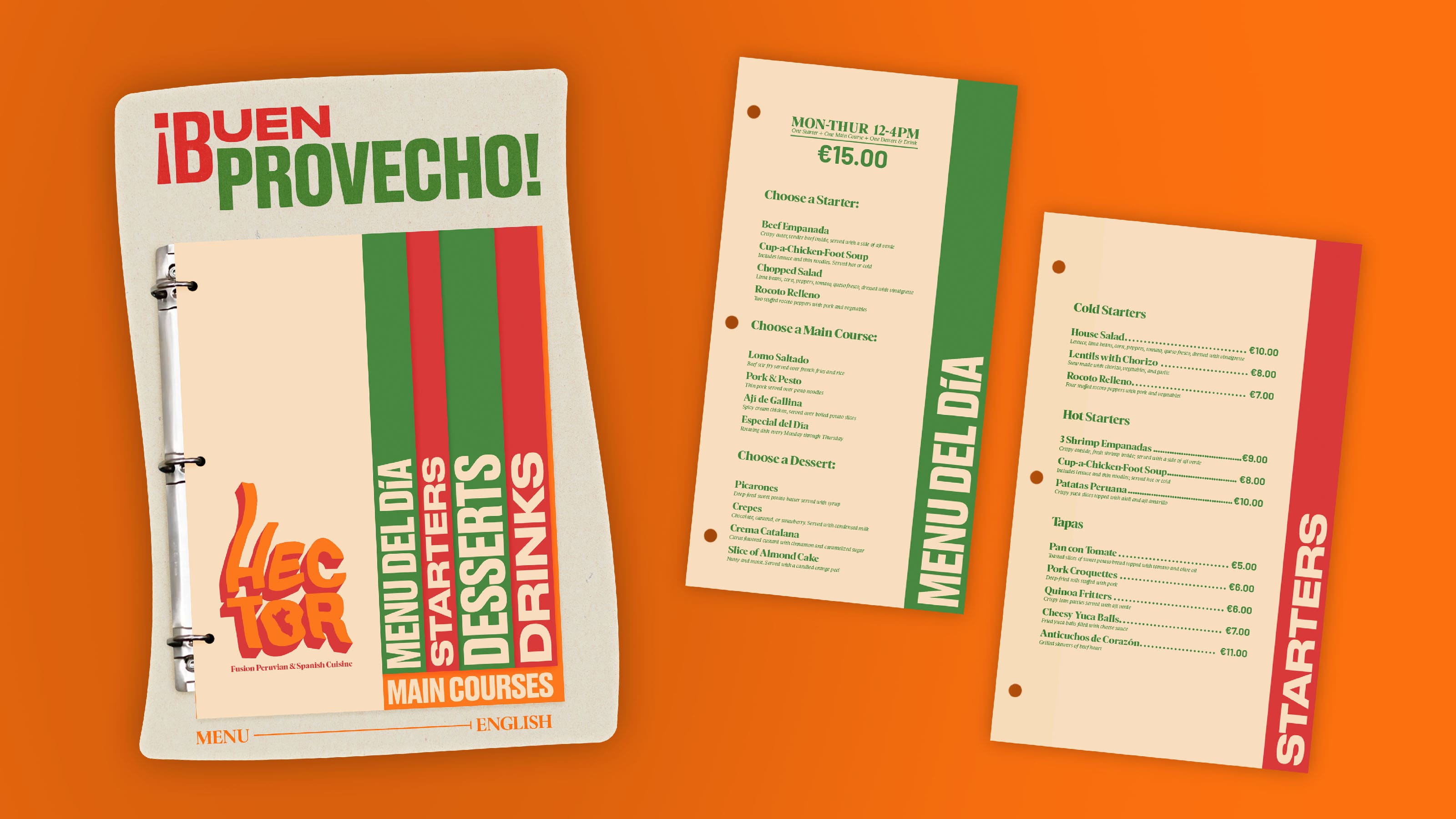
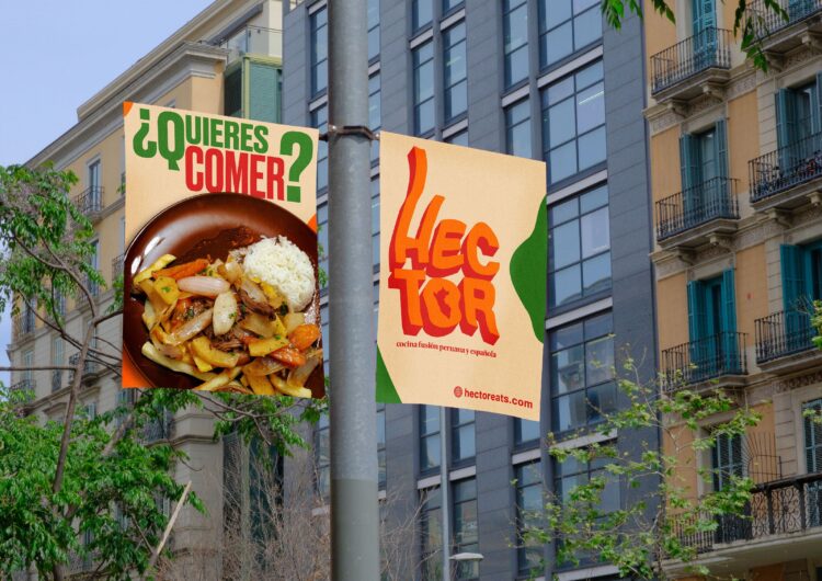
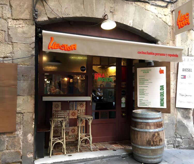
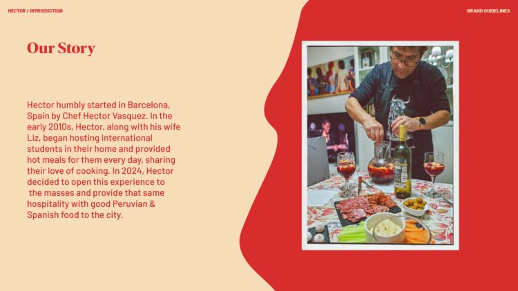
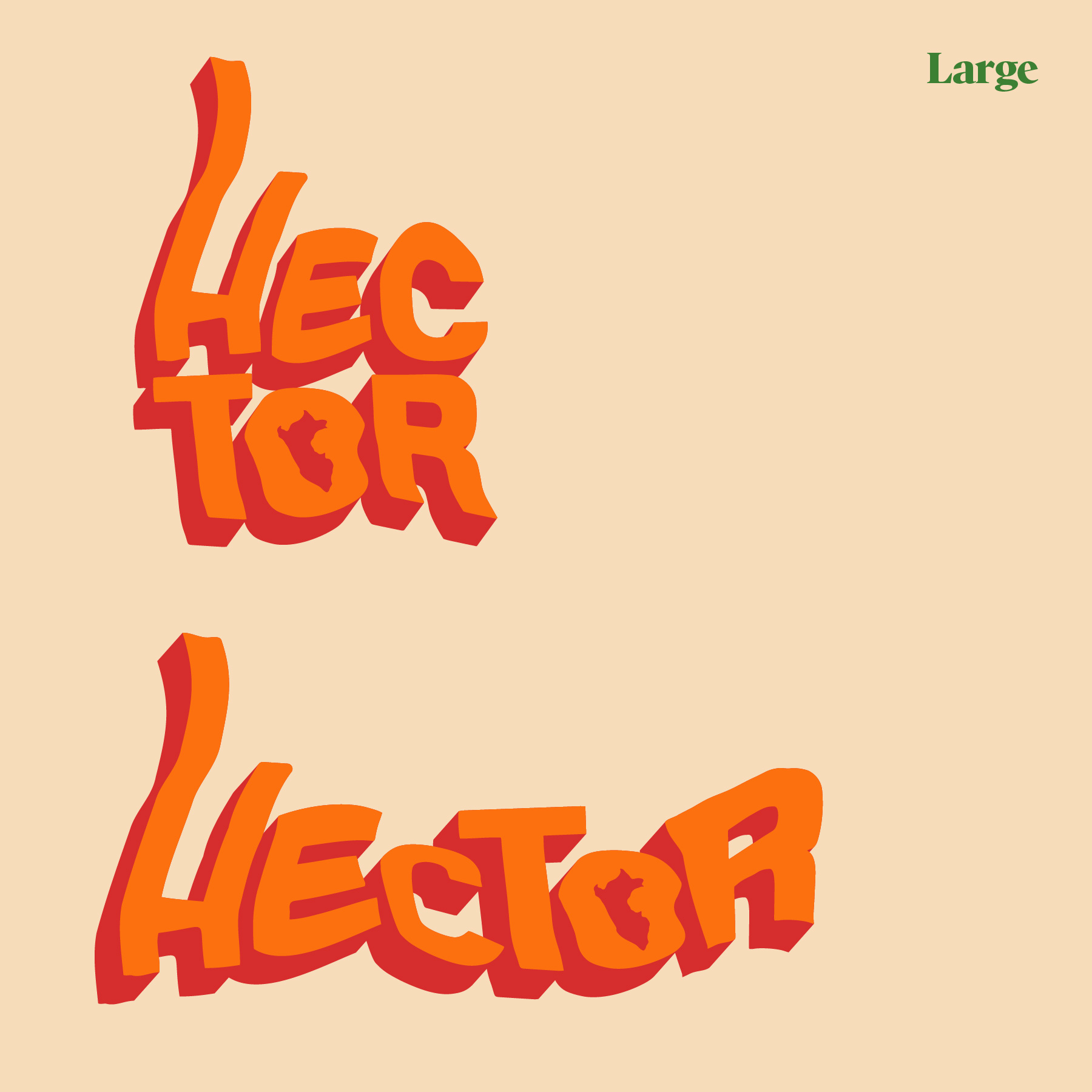
I am very happy with the results. The color/monomark was an additional unique challenge. I wanted a shortened version of the name that also could serve as an abstract mark based more on the laces. I feel like I succeeded with achieving that goal. Overall, I learned just how much I enjoy making custom type and problem solving little details throughout branding.

UpUGo’s original logo
Initial sketches
First go at the logo
Trying the shoelace forming the type
Starting to create the texture
Close to final versions with rejected extra marks
Download Image

I don’t usually start out introducing a project with the experimentation I did, but I feel it fits the nature of my process for my final project. As a class, we were tasked with creating a wholistic brand system in three phases (logo, collateral, and brand guidelines) for an eatery of our choice. I was stoked when I found out about this and decided I wanted to use this project as a way to push some interesting brand techniques I learned at ELISAVA.

Download Image

My biggest goal with the logo phase was to create interesting letter forms with a photo scanner to make unique type lockups for my it using warped text. There was a lot of discovery within the initial planning and text experiments.

Some more letter experiments
I really liked how these letterforms came out
Download Image

Initially, I was hooked on the idea of creating an eatery based around a painting, but then I pivoted to something a little closer to home: creating an eatery based on the host dad of my homestay last semester, Hector. His love of cooking was as inspiring as it was delicious, and I wanted to pay homage to him through my work. 

I thought it important to include both English and Spanish taglines so there no confusion between languages what Hector is
I found that the “o” in Hector made a nice mark to use
Download Image

Building the collateral was some of the most fun I’ve had all semester. I really enjoyed experimenting with colors and combining the typography in different ways. The biggest challenge was finding mockups that not only looked good, but also felt consistent across the entire range of things I am displaying. I am very happy with my selection and I feel like I significantly improved over my alphabet soup project.

A familiar banner to those who have seen my Jenny Holzer Exhibition work
Storefront taken from an actual storefront in the gothic quarter of Barcelona
Ají verde is one of the most well known Peruvian sauces in the world. I figured Hector would have his own take on it
“For later” to-go box
Letterhead
This utilizes another catchphrase lockup
One of the cleanest uses of a catchphrase in my opinion
It’s a pen
Delivery in Barcelona can get tricky in tight areas, Hector’s delivery guy is ready for anything
I actually created an embroidery effect on this logo to appear more realistic on the chef whites
Coasters using the “o” mark
“Do you want to eat?” instagram ad, utilizing an actual image of Hector’s cooking
Download Image

The final phase of the eatery brand system, the style guide, took everything we had made and put it all in one place, while simultaneously reinforcing the branding. I really wanted my guide to be orderly while also having a visual interest in each page that varies, similar to the book I created at ELISAVA. It was important to me to reinforce the multilingual aspect of a restaurant in an international city, which is why this brand guide is the “english version.” These images below are a few of my favorite pages, but for the full experience, I recommend you check out the full document here.

Adding a little narrative felt appropriate, as well as giving me an opportunity to show Hector somewhere in my materials
Branding adjectives were, again, important to reinforce the design decisions
I really like how this layout feels
I really like how this looks and it proves my mockups work well together